CCCS Internal
 CCCS Brand Guidelines & Logo Files
Hearing our name, seeing our colors, or exploring our campuses evokes certain expectations, associations, and promises. Together these form our brand. When we are on brand we are staying true to the vision that our community has of us and the promises we have made them. We deliver what we have promised with truth and integrity. Because these are things that matter.

How to Apply the Brand
Applying CCCS’s brand starts with understanding the tools and resources that make up our brand platform. Explore our brand guidelines to learn how to apply consistent graphics, symbols, fonts, images, and colors to unite all system office marketing and communications across platforms.
Design Specifications
Preferred Full-Color Logo
The Pantone, CMYK or RGB full-color logos are preferred. Use Pantone or CMYK for any print use such as collateral or business materials. Use RGB for electronic use such as PowerPoint presentations, digital or video.
Reverse (Knockout) Logos
Use the reverse logos for applications on color or photographic backgrounds. Always ensure that the background you choose provides sufficient contrast for the logo.
To ensure visibility and legibility, logos should never be presented in sizes smaller than the requirements shown on this page.
To maintain visual integrity, applications using alternative reproduction techniques such as embroidery and silkscreen may require presenting the logos at larger sizes than indicated here.
These are only minimum sizes. Logos should be sized appropriately for the piece being designed. Consult your print vendor for specifics on minimum sizes based on the piece you are creating.
Print 2 inches, Digital 250px

To ensure visibility and legibility, logos should never be presented in sizes smaller than the requirements shown on this page.
To maintain visual integrity, applications using alternative reproduction techniques such as embroidery and silkscreen may require presenting the logos at larger sizes than indicated here.
These are only minimum sizes. Logos should be sized appropriately for the piece being designed. Consult your print vendor for specifics on minimum sizes based on the piece you are creating.
Stacked Logo Print 1.25 in, Digital 125px

Brand Mark Print 1 in, Digital 100px
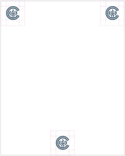
The justified appearance of the horizontal logo allows it to be aligned to any edge of the paper or be placed at the center.
On printed materials the minimum distance from the edges of the logo to the edges of the piece should be equal to the height of the C in the word Colorado.
Placement of the logo on promotional pieces is more flexible based on the relationship to artwork and photos.
To maintain a consistency in appearance, the logo should be mainly used centered on the page.
On printed materials the minimum distance from the edges of the logo to the edges of the piece should be equal to the height of the C in the word Colorado.
Placement of the logo on promotional pieces is more flexible based on the relationship to artwork and photos.
The brand mark should be mainly used whenever the primary logo is not possible due to spacing restrictions, or when using the full name becomes redundant. Its placement is versatile as it can be placed in the center, right or left justified.
On printed materials the minimum distance from the edges of the mark to the edges of the piece should be equal to the height of the flame.
Placement of the mark on promotional pieces is more flexible based on the relationship to artwork and photos.
If the logo needs to be placed on a photo, use a white or solid color logo to create contrast.
This rule applies to all Colorado Community College System logos.
One-Color Logo
Correct and consistent use of the primary logo is an essential part of building brand equity. While a great deal of flexibility has been built into the visual identity system, the correct use of each element has been carefully defined.
The examples shown here represent some–but not all–of the ways the Colorado Community College System logos might be used incorrectly. If you have questions about the correct or incorrect use of the school’s logos, contact The Office of Marketing and Public Relations.
Incorrect logo rules apply to all Colorado Community College System logos.
Do not add a drop shadow or any other effects to the logo.
Do not place the primary logo in a container shape of any type.
Do not place the logo on a color that does not provide sufficient contrast.
Do not place the logo on visually distracting backgrounds.
Do not change the typeface of any part of the logo.
Do not use unapproved color configurations of the logo.
Co-branding helps show unification between Colorado Community College System and our partners. When co-branding communications, it is critical to follow all the guidance in this manual.
The Colorado Community College System logo should be placed on the left with a divider line separating partner logo(s) to the right.
The divider line should be a stroke of 1 point and gray (30% black).
It is important to ensure all partner logos are of visually equal weight and nothing has more prominence than the Colorado Community College System logo.
Colorado Community College System clear space for logos must be observed with increased space of 2x the width of two C’s in Colorado (in gray).
Co-branding rules apply to all Colorado Community College System logos.